Chart Types and Their Uses in Real-Time Trading
Real-time stock market analysis relies heavily on various chart types to visualize price movements and identify potential trading opportunities. Understanding the strengths and weaknesses of each chart type is crucial for making informed decisions. Different charts highlight different aspects of price action, making some more suitable for short-term trading while others are better suited for long-term strategies.
Candlestick Charts
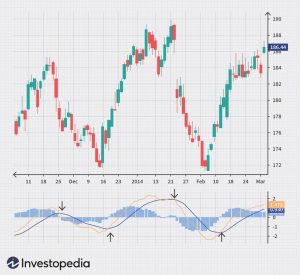
Candlestick charts are arguably the most popular chart type among traders. Each candlestick represents a specific time period (e.g., one minute, five minutes, one day), showing the opening, closing, high, and low prices. A long green (or white) candlestick indicates a strong upward move, while a long red (or black) candlestick signifies a strong downward move. Small candlesticks represent relatively low volatility.
The body of the candlestick represents the range between the opening and closing prices, while the “wicks” or “shadows” extend from the body to show the high and low prices. The advantage of candlestick charts lies in their ability to clearly visualize price action and identify patterns like engulfing patterns, hammers, and dojis, which can signal potential reversals or continuations of trends.
A disadvantage is that they can become cluttered with information, making it difficult to discern patterns in highly volatile markets. Candlestick charts are useful for both short-term and long-term analysis, depending on the timeframe selected. For example, a trader might use 5-minute candlestick charts for scalping (very short-term trading), while a long-term investor might use daily or weekly candlestick charts.
Line Charts
Line charts are simpler than candlestick charts, connecting the closing prices of each period with a continuous line. They are useful for visualizing trends over longer periods, focusing on the overall direction of the price rather than the intra-period fluctuations. The advantage of line charts is their simplicity and clarity, making them easy to interpret, especially for identifying long-term trends.
However, they lack the detail provided by candlestick charts, making them less suitable for identifying short-term trading opportunities or subtle price reversals. Line charts are generally better suited for long-term analysis. A trader focusing on swing trading (holding positions for several days or weeks) might find line charts useful in identifying major support and resistance levels.
Bar Charts
Bar charts are similar to candlestick charts, but instead of a “body,” they use a vertical bar to represent the price range within a specific period. The high and low are represented by the top and bottom of the bar, while the opening and closing prices are often marked with small horizontal lines within the bar. Bar charts offer a similar level of detail to candlestick charts, allowing for the identification of price patterns.
The advantages and disadvantages are largely similar to candlestick charts, with the main difference being the visual representation of the price data. Bar charts, like candlestick charts, can be used for both short-term and long-term analysis depending on the chosen timeframe. A day trader might use 1-minute bar charts to identify short-term price movements, while a long-term investor could use monthly bar charts to track long-term trends.
Interpreting Real-Time Chart Patterns
Identifying potential trading opportunities involves recognizing chart patterns that suggest a change in price direction or momentum. For example, a “head and shoulders” pattern, visible on candlestick or bar charts, often signals a potential price reversal. This pattern consists of three peaks, with the middle peak (the “head”) being the highest. A breakout below the neckline (a line connecting the troughs on either side of the head) would be considered a bearish signal, indicating a potential downward trend.
Conversely, an “inverse head and shoulders” pattern suggests a potential upward trend. Real-time interpretation requires understanding these patterns and combining them with other technical indicators and fundamental analysis to increase the probability of a successful trade. It’s important to note that no chart pattern guarantees a specific outcome, and risk management strategies should always be employed.